PELE Plotter
In this tutorial, you will learn how to create custom plots with PELE Plotter.
Prerequisites
Before attempting this tutorial you should install PELE Platform (version 1.6 or higher) and activate the Python environment you normally use to run it. You can run the following command to check if everything is working correctly - it should print a list of all available arguments.
python -m pele_platform.plotter -h
Simple plots
1. Select data source
The data can come from multiple sources, so feel free to choose any of the following:
the CSV file generated during the simulation. It is located in
working_directory/results/data.csv.path to the output folder of PELE. Usually it is found in
working_directory/outputand it is the folder that contains the epochs with their report and trajectory files.path to the results folder where the CSV file is stored. It is located in
working_directory/results.
Please, mind that each data source requires a use of different command line argument:
python -m pele_platform.plotter -o /home/LIG_Pele/output/ ...
python -m pele_platform.plotter -r /home/LIG_Pele/results/ ...
python -m pele_platform.plotter -c /home/LIG_Pele/results/data.csv ...
2. Select plot type
The new Plotter offers four different plot types, each able to visualise up to three data columns (except for the density and histogram plots, which can only display two columns):
standard scatter plot
density plot, similar to scatter, but displaying kernel density estimates (KDE) on the axes.
histogram plot, similar to the density plot but showing histograms instead.
interactive which allows you to hover over data points to determine which trajectory they originate from.
You should set the plot type using -t argument, however, if you do not, it will default to the standard scatter plot.
3. Choose metrics to plot
You can plot any of the metrics appearing in your report files by pointing the Plotter to the right column number. As a minimum, you will have to provide metrics for x- and y-axis, however, you can also set z-axis, which will colour the data points according to that metric (this does not apply to the density or histogram plots).
If you are unsure which numbers correspond to each metric, you can simply set data source and plot type and hit “enter”. The tool will show you all available options and walk you through the setup.
Customization
Colour scheme
Once you get the basics done, you can customize the colour scheme of your plot using the following arguments:
--colorto change the colour of the data points, you can select one of the built-in options:
blue
red
green
purple
orange
--colormapto select the colour scheme for representing values on the Z-axis, choose one of:
plasma
magma
turbo
jet
gnuplot
gnuplot2
nipy_spectral
spectral
cividis
inferno
autumn
winter
spring
summer
wistia
copper
blues
reducedblues
reducedgreens
reducedreds
reducedpurples
reducedoranges
--background_colorto customize the background of your figure. It must be a CSS4 compatible color name.
Custom lines
Draw custom vertical and horizontal lines to highlight relevant thresholds on your plot, using the following arguments:
--vertical_line n color
--horizontal_line n color
Where n is the point of intercept on the axis and color corresponds to the desired colour of the line.
It must be a CSS4 compatible color name.
Axis labels and title
Override the default axis labels by passing a string after the metric column number, e.g.
python -m pele_platform.plotter -o /home/LIG_Pele/output/ -t scatter -x 7" RMSD of the ligand" -y 5 ...
Moreover, to add a custom title to your figure, all you have to do is use --title argument and supply a string with your desired text.
Filters and ranges
Apply custom filters to data points by setting specific thresholds for each column, it can be done by passing the following parameters to the --filter command line argument:
column number corresponding to the metric where the filter will be applied
character representing the condition to apply in the filtering, one of:
<,==,>,<=,>=orlt,eq,gt,le,gethe cutoff value.
For example, to include only those values from column report 5, which are greater or equal 15, you’d do the following: --filter 5 >= 15
You can also plot only the relevant data by setting limits to the scope of values plotted on each axis using the following flags:
--xlowest
--xhighest
--ylowest
--yhighest
--zlowest
--zhighest
Other
You can further customise the density plot by using:
--with_edgesargument to visualise the distribution on the plot area
--n_binsto define the number of bins to display in the histogram plot, first element corresponds to the X axis and the second to the Y axis. If only one value is provided, it will be applied to both axes.
--n_levelsto adjust the number of levels shown on the plot area.
Finally, the Nostrum Biodiscovery logo can be hidden by using --hide_logo argument.
Saving to file
If you want to save the plot to a file instead of displaying it, use the --save_to argument and supply a path to the file (this option does not apply to interactive plots).
Examples
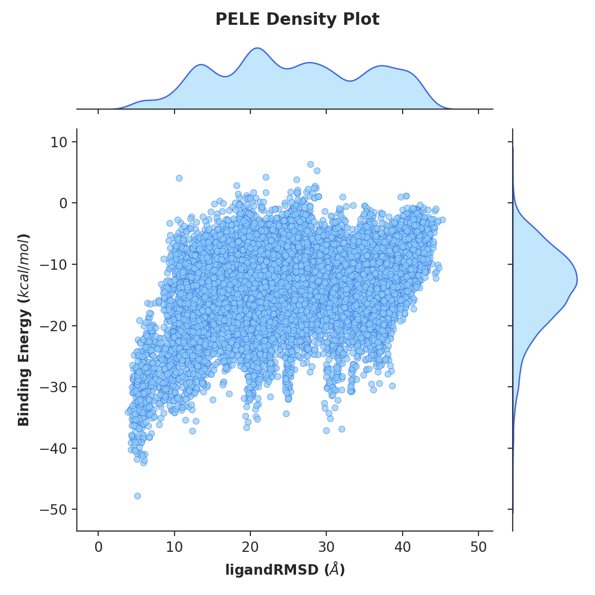
Example 1. Density plot of ligand RMSD versus binding energy
python -m pele_platform.plotter -o /home/LIG_Pele/output/ -t density -x 7 -y 5 --hide_logo
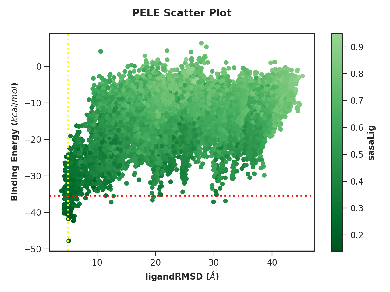
Example 2. Scatter plot with custom colour scheme and lines
python -m pele_platform.plotter -o /home/LIG_Pele/output/ -t scatter -x 7 -y 5 -z 6 --colormap reducedgreens --vertical_line 5.0 yellow --horizontal_line -35.5 red --hide_logo
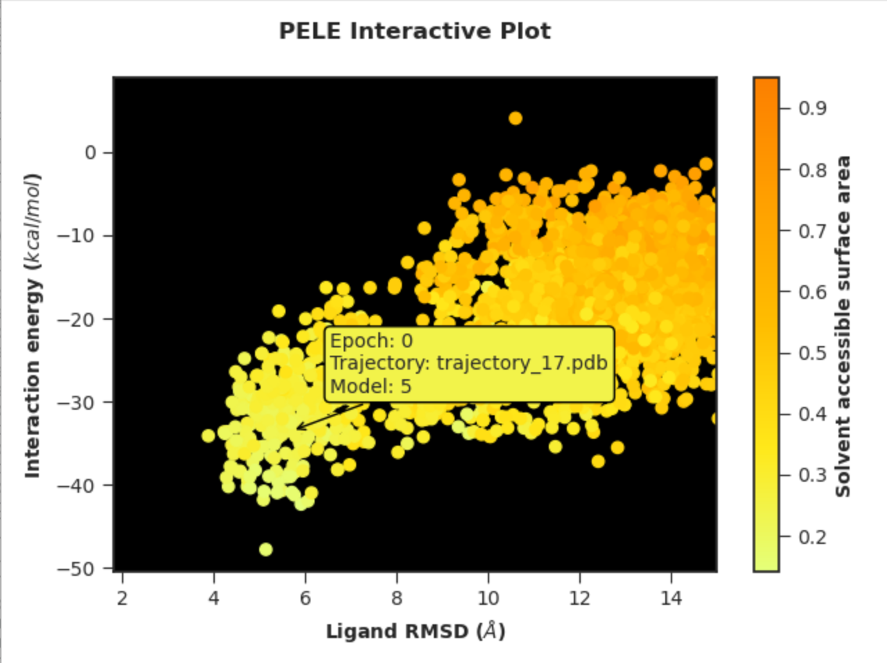
Example 3. Interactive plot with custom axis labels, ranges and colour scheme
python -m pele_platform.plotter -o /home/LIG_Pele/output/ -t interactive --xhighest 15 -x 7 "Ligand RMSD" -y 5 "Interaction energy" -z 6 "Solvent accessible surface area" --colormap wistia --background_color black --hide_logo
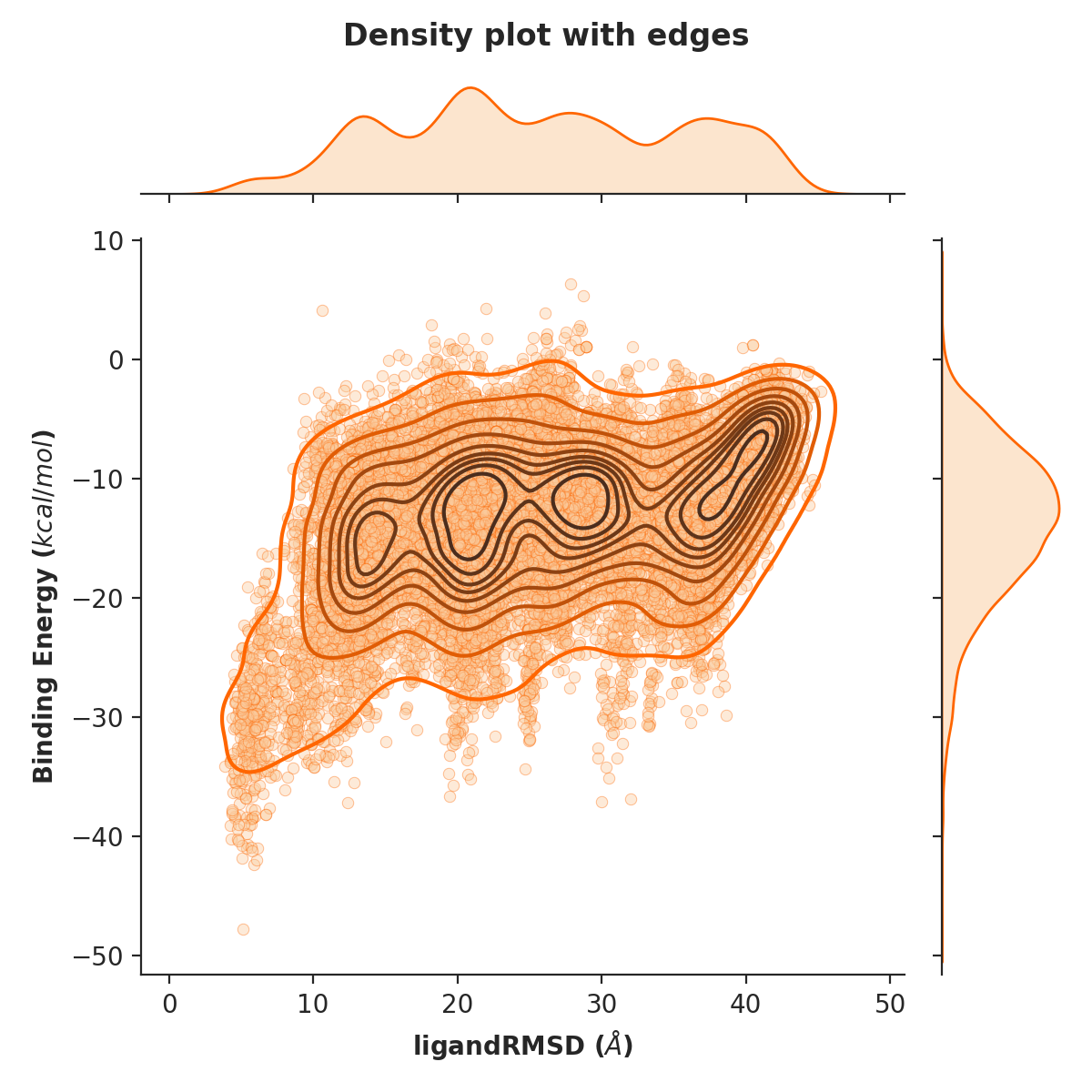
Example 4. Density plot of ligand RMSD versus binding energy with orange data points as well as visualised edges (10 levels)
python -m pele_platform.plotter -o /home/LIG_Pele/output/ -t density --with_edges --n_levels 10 --color orange --hide_logo --title "Density plot with edges" -x 7 -y 5 -z 6